Summary: To make daily updates feel different from one day to the next, I generated a unique color combination for every day of the year. Check out the background below, or jump straight to the demo to try them out.
Inspiration
Recently, I've been tinkering with a side project that would involve a daily news digest. I was interested in finding a way to make each day's update feel unique and special, beyond just adding the date at the top.
My first thought was a little icon—each element could change to signify the day, month, day of the week, etc. It might have worked something like this:
Then, I thought the icons could be different colors throughout the year, too. Then, I thought the whole update could just be a different color every day! That would be much easier than having complex icons that most people wouldn’t bother to decode. Plus, the colors could sort of naturally line up with different times of the year: warmer tones in the summer, cooler tones in the winter, green in the spring, and so on.
So I ditched the icons and got to work on coming up with 365 colors.
HSL colors
My first thought was to use the HSL color system. Unlike RGB, which defines colors with three values for Red, Green, and Blue, HSL colors use three different values: Hue (0-360), Saturation (0-100), and Lightness (0-100). Hue tells you where on the color wheel you are, saturation tells you how far from the center, and lightness how light or dark the entire wheel is.
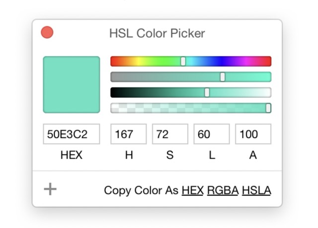
Here’s a sample HSL color picker to demonstrate how it works (source). The top bar is "hue" (picking which part of the rainbow you're in), the second bar is "saturation" (from gray to most vibrant) and the third bar is "lightness" (from pure black on the left to pure white on the right).
Since the hue value goes from 0-360, a good way to get 360 unique colors might be to pick some saturation and lightness values and then just change the hue value by 1 every day. We’d still be 5 days short, but that's pretty close!
First attempt
I decided to make two versions of every color: a dark color for text and/or accents, and a much lighter version for the background.
To do this, we'll keep saturation at 100% to get nice, vibrant colors. Then the darker version can have a lightness value of 30%, with the background version at more like 90%. Here’s what that looks like—the darker color is the border on the bottom of each "card":
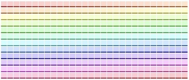
Not bad! But not perfect, either. Let’s make a few improvements:
Yellow
Some of the yellows here don't have very good contrast, so text in the darker color would be hard to read. And besides that, the darker color is more of an unattractive grayish brown. Not great.
This is a version of the "dark yellow problem". What we think of as "yellow" is by nature lighter than other colors. For example, see this chart of 'relative luminance' from the linked article:

If we try to make our yellow a similar 'luminance' as these other colors, it just looks brown:
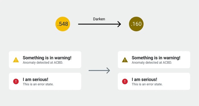
I had a couple of ideas to combat this issue. For one, we can move through the yellows faster, changing the Hue value by 2 points per day rather than 1. This way we won't have as many days where this is a problem, although we'll need to make up for those days somehow with extra colors.
Another tweak is to gradually decrease the lightness value of the darker color for these colors, down to 20%. This will tend our color more towards brown, but it will be much easier to read, which is more important.
Adding more days
Another issue is that our original rainbow only had 360 colors, and now we’ve taken some of those away to fix the yellow problem. But we need 365 colors.
What about leap years? I decided it would be simpler to just stick to 365 colors. In a leap year, December 31st will have the same colors as January 1st of the next year.
So how do we add more?
I decided to add black and white as an extra color option as well, fitting it in among the blues. We can just decrease the lightness of the foreground towards 0% while increasing the lightness of the background to 100% to blend towards black and white. This will buy us some extra days.
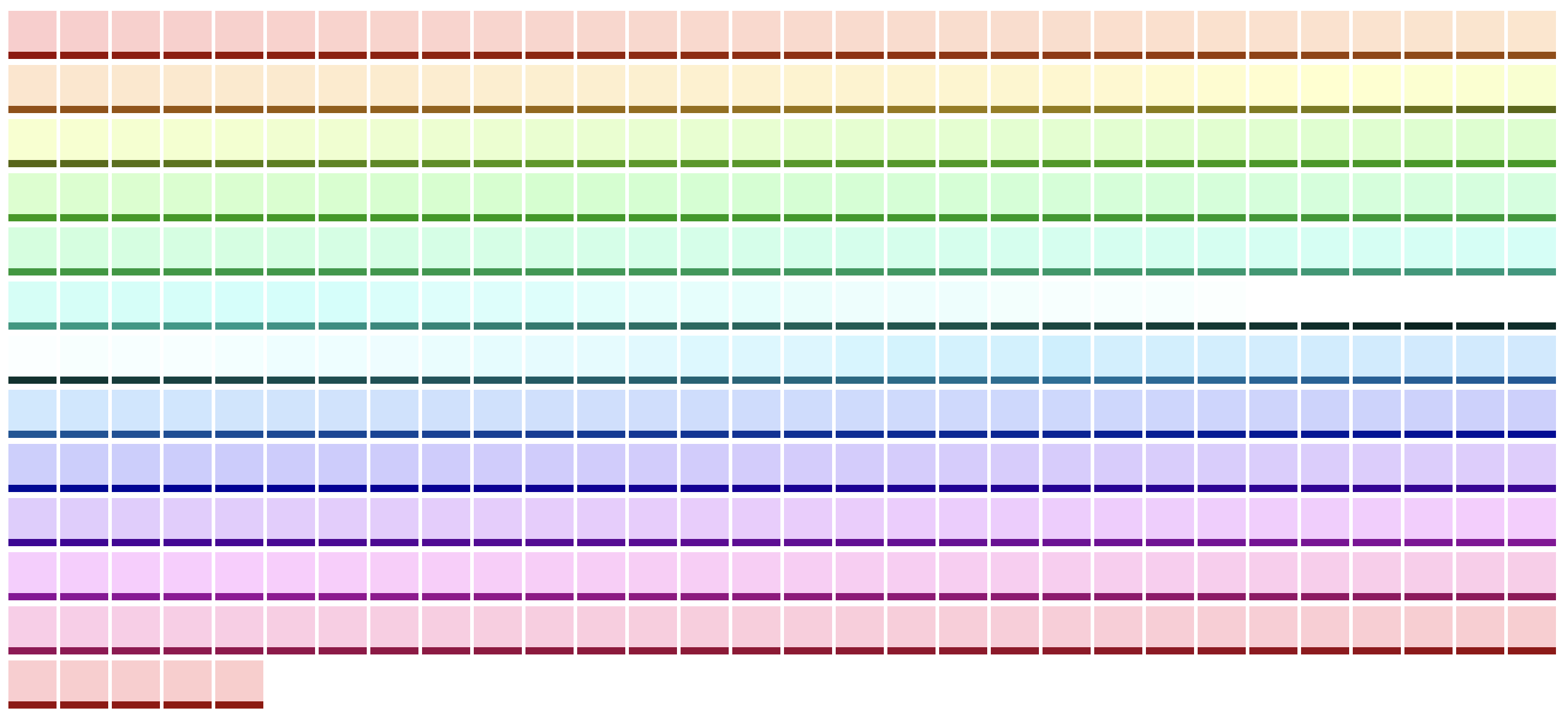
Here's what the updated rainbow looks like, with some changes to the yellows and the new black + white section:
Lining up the colors with months
Now we have a color for every day—but how should we organize them throughout the year?
If we imagined taking the version above and lining it up with a calendar, I don't think the order of the colors would make much sense:. January doesn’t seem “red” to me, and the ice blue and black seem more like winter than summer. But some things do work well—green definitely fits better in the spring than the fall.
After playing around with some options, I got to a layout I like. First, I reversed the order of the colors to have green come before red. Then I offset them to put the cooler colors in the winter.
Result
Here’s the final 365-color rainbow:
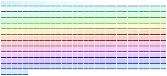
Try them out below! Pick a date and see what the colors look like. (Or, you can download all the colors in a CSV file.)
Color Sample
January 1
Background: hsl(195, 100%, 90%)
Foreground: hsl(195, 100%, 29%)